I’ve been experimenting with curved block compositions and combining solid and print fabrics in the same quilt top for the last week. It’s something I’ve thought about before, but I was inspired by a last minute tweak to a class I taught in Arizona last week. You can read about the class here.
Many of my students want to use print fabric in their improv designs, and some of them have come up with some very successful compositions that way. Most of my quilts are made of solid fabrics now, because I like their graphic nature and the fact that my stitching shows up better on solids than it does on prints. But what if I tried some solid/print combinations too?
“What If” is my favorite question.
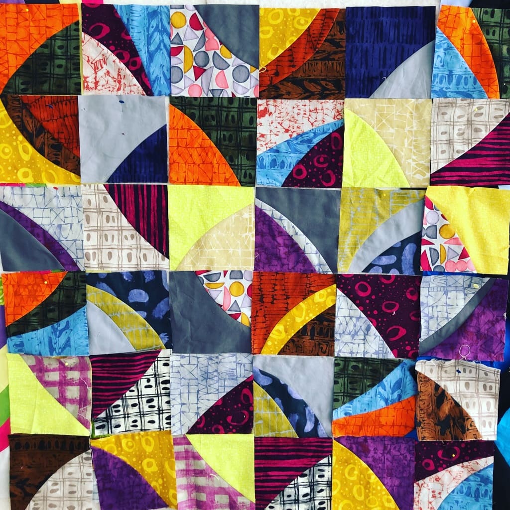
Prints and Curves Version 1 – Cindy Grisdela
I started with some prints I’d bought recently. I cut squares and paired them up, then cut Improv Curves and sewed them back together. There are a few solids in there too. Not happy with the result. It’s too chaotic–and definitely not me.
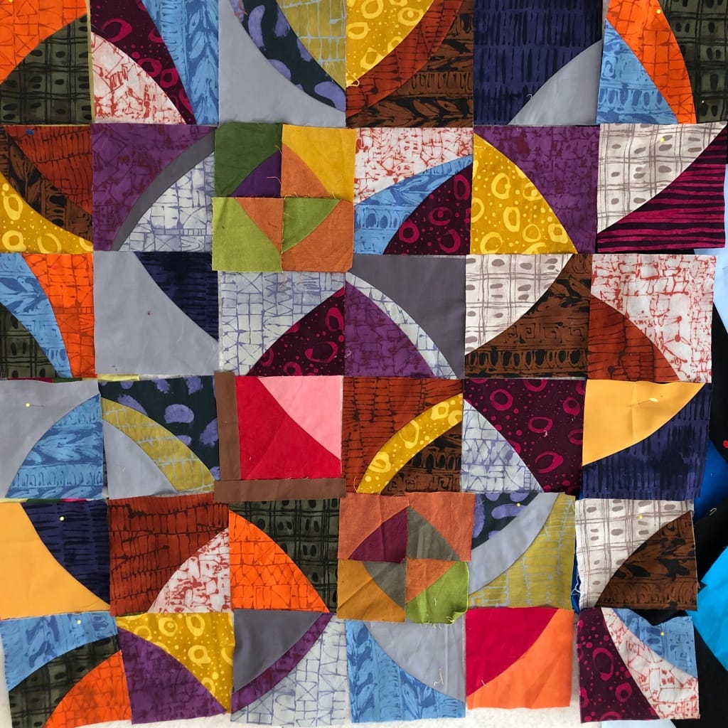
Prints and Curves Version 2 – Cindy Grisdela
I took out all the yellow and lime green blocks, plus one of the prints that was distracting to me. Then I added in some leftover blocks from my scrap basket. The small green, gold and purple blocks are those, plus a red and pink and a red and orange block. I liked the different scale, and because the larger blocks were a bit too small I came up with the idea of using “coping strips” to make them bigger. But it still didn’t really work for me.
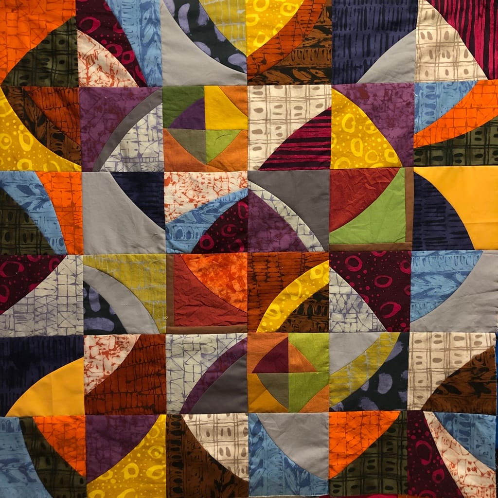
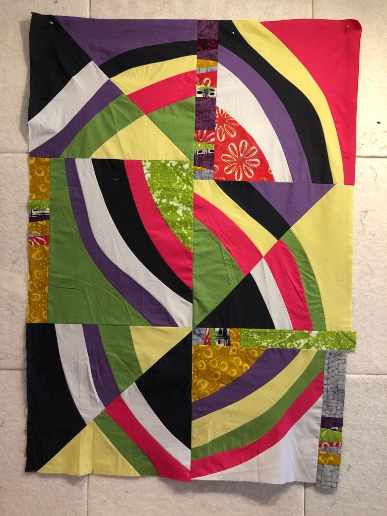
Prints and Curves Final Version – Cindy Grisdela
For the final, I took out the pink and red and orange and red blocks, and remade some additional blocks that used one print and one solid fabric. The result is better, but I don’t see myself going this route very often. Perhaps it’s partly the color choices–I liked these fabrics, but they are darker than I normally use.
For fun, I made another version in just solids–you can see that one at the top of this post and below. I’m MUCH happier with this one! It uses a more controlled color recipe and I like the way the lines and curves are stronger. I used different scales in the blocks and varied the cuts, plus I added in three “coping strips” when the block wasn’t quite big enough. These lines add interest to the final design, I think, and it’s a valid way to deal with a construction problem without remaking all the blocks.
These quilt tops are about 33″ square.
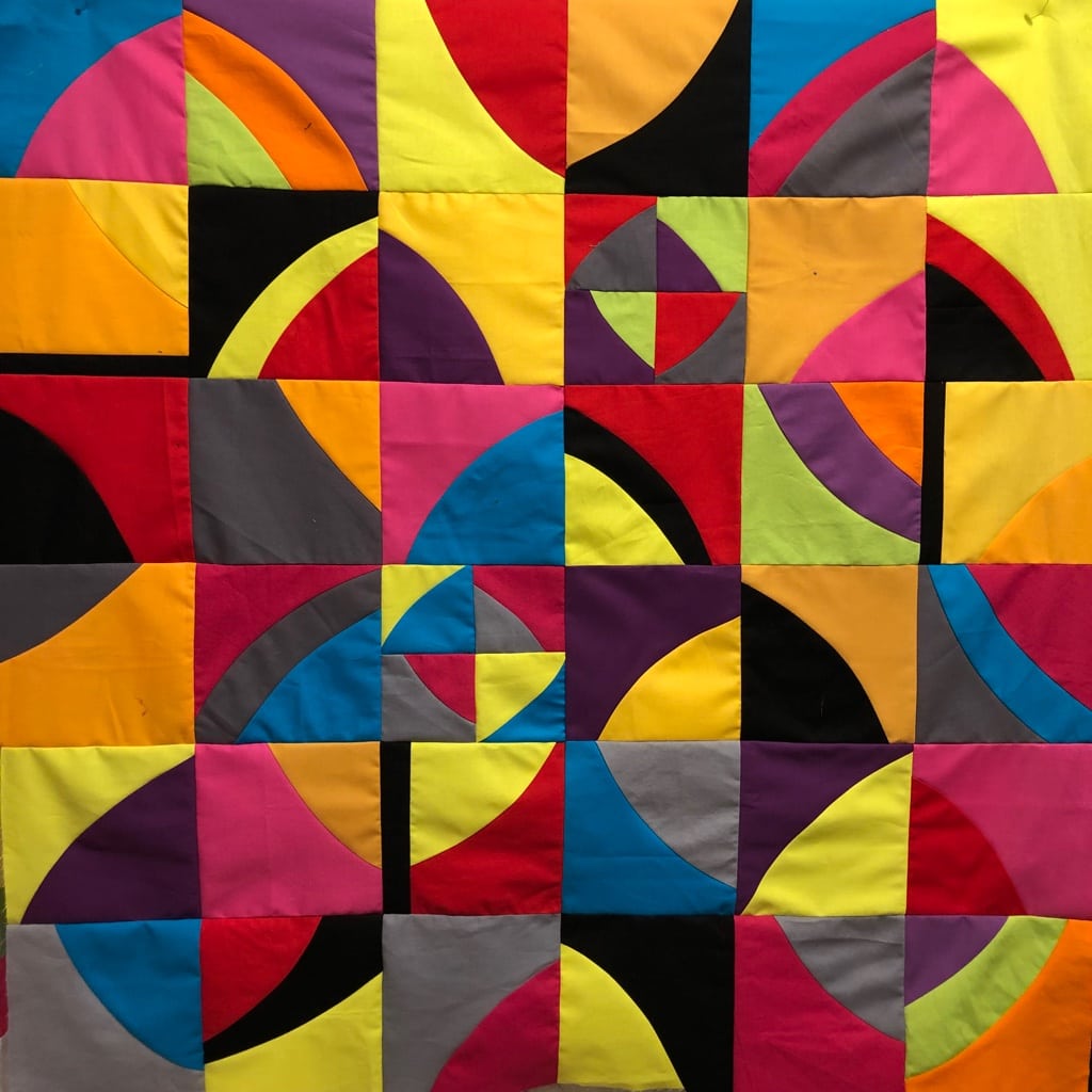
Just Solids and Curves – Cindy Grisdela
I’ve had another curved composition on my design wall for several months, and while I was at it, I finished putting it together.
Summer Curves Final Top – Cindy Grisdela
Looking at this one, I see that it’s a better composition because the print fabrics play a supporting role, rather than being the focus of the composition. In a strange way, they allow the eye to rest a bit from the strong solid colors in the rest of the design.
Lessons Learned:
- It can be effective to combine prints and solids in one improv composition, but it may work better if the prints are used sparingly.
- Always check the leftover basket to see if there’s something there that will add to the composition–I might not have thought of using the smaller scale blocks if they hadn’t been lying around waiting for the right project.
- “What If” is a powerful question.
- This could be a fun way to teach curved piecing!
Thanks for reading along with this experiment. It’s difficult sometimes to put work out in public that isn’t quite ready for primetime, but I’m committed to sharing my process, not just my successes! And I learned a lot from this exercise–I hope there are some takeaways for you too.
Cindy, I agree. Prints should be used sparingly, and should play a supporting role. But I love the texture they bring to a piece!
Hi cindy–new follower here. Love your improv, and especially appreciate the window to your thought process!
I work primarily with prints, but agree they are too chaotic so I tend to keep them under control by limiting myself to one color– but then pushing that color to every tone imaginable.
Prints are cool because they do let you introduce many different colors but in a lesser role while still basically keeping to your “one color” theme. Just throwing that out there to say, don’t totally give up on prints yet!
Thanks for the thoughtful comment and great idea about working with prints, Jackie! I’m definitely not giving up on prints–just have to figure out how they work for me. I’ll try your idea.